Kreawi
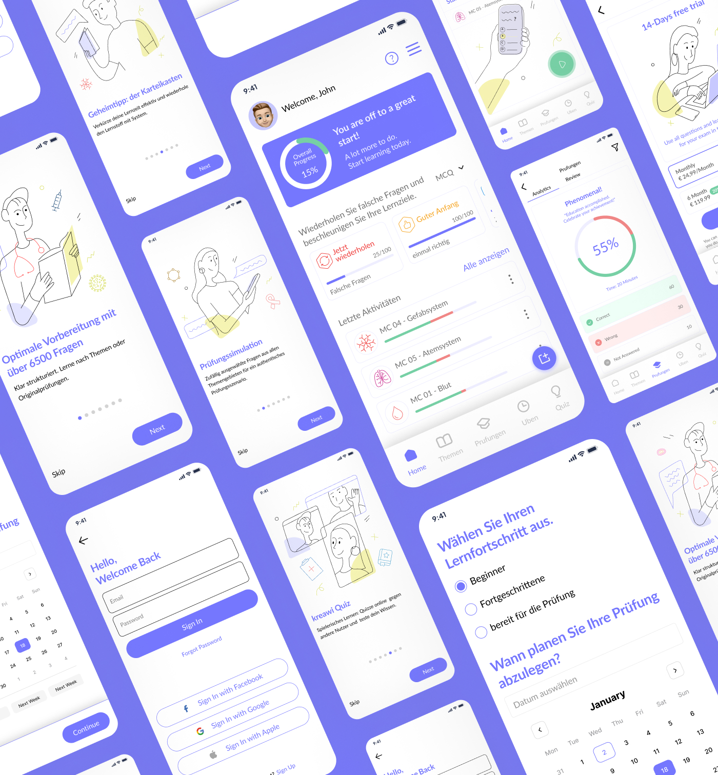
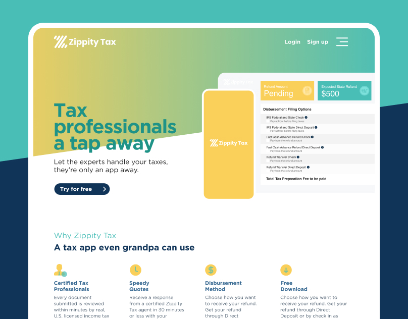
We led the complete redesign of a learning platform for health practitioners. Starting with a full UX audit of the existing app, we identified key usability issues and opportunities for improvement. Through in-depth UX research, we crafted a user-centered experience supported by a modern UI design. The final solution was designed and prototyped in Figma, delivering a seamless and engaging platform that enhances learning outcomes.
The Challenege
The old platform suffered from poor navigation and a cluttered page structure, making it difficult for health practitioners to find content quickly and complete their learning tasks efficiently. This lack of clarity negatively impacted usability and overall engagement.
Services:UX Audit
UX Research
Iconography
1
Design Audit
We started with a detailed review of the existing platform to evaluate usability, visual consistency, and overall user experience. This helped us identify pain points in navigation, layout, and content hierarchy.
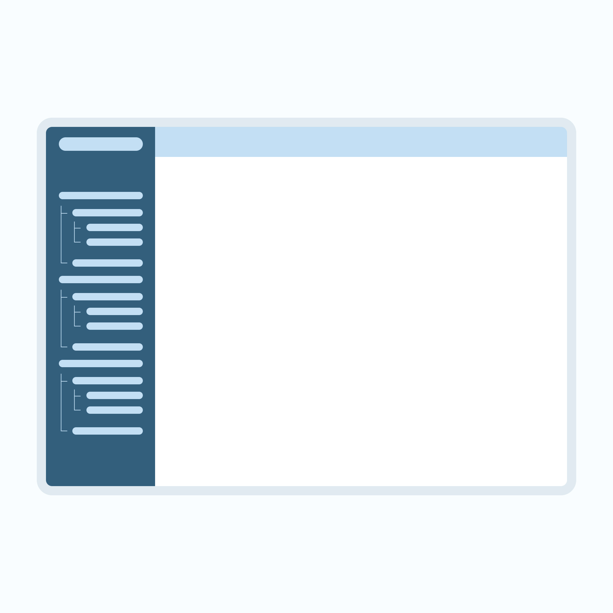
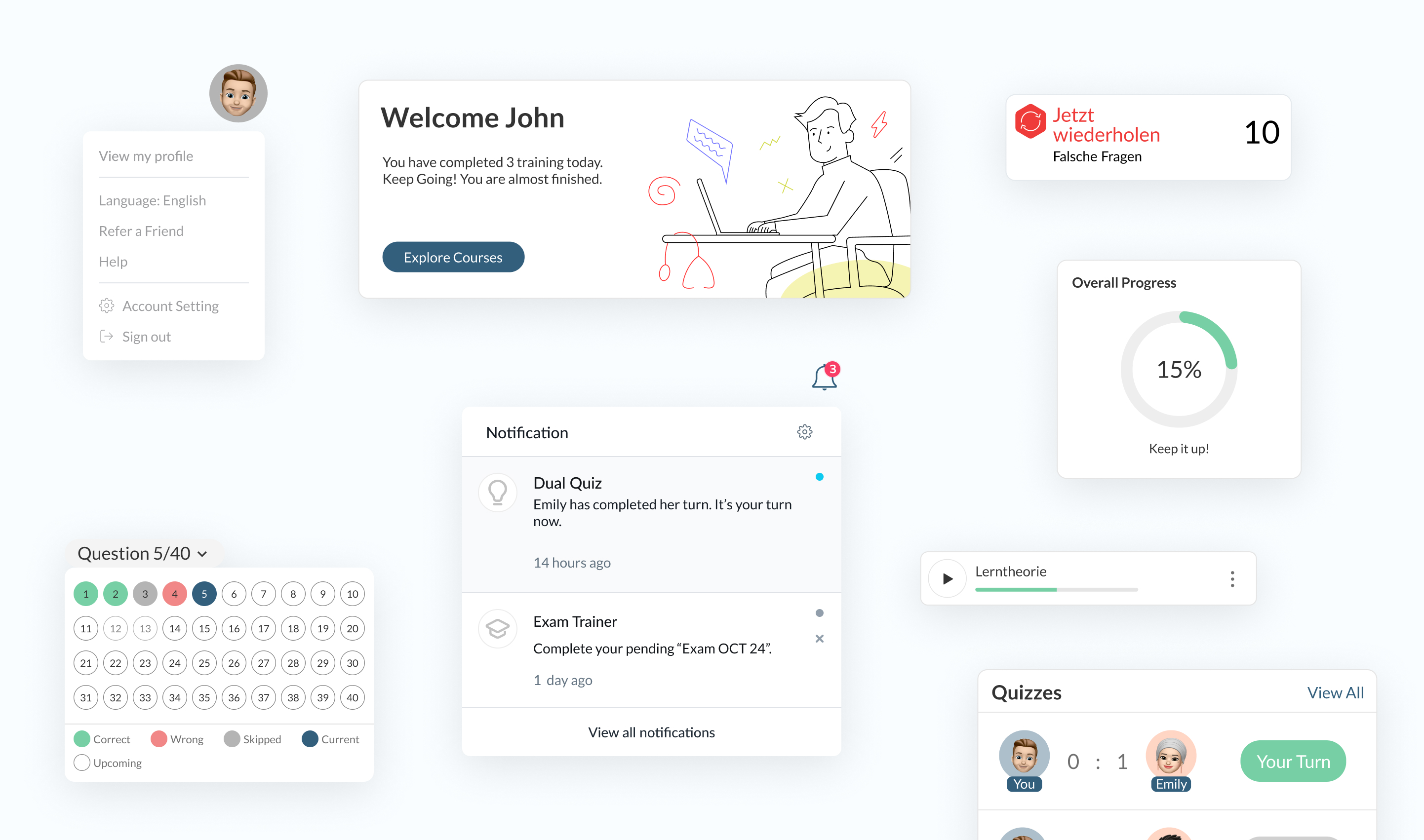
The previous navigation relied on multi-level dropdowns positioned on the left, which created complexity and hindered usability.
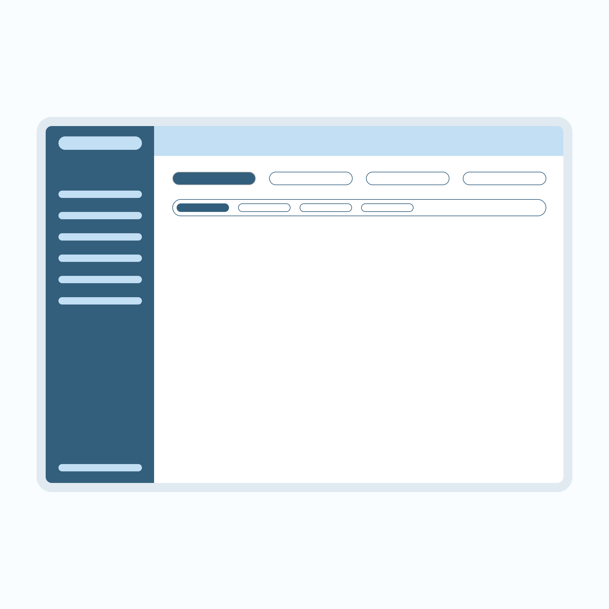
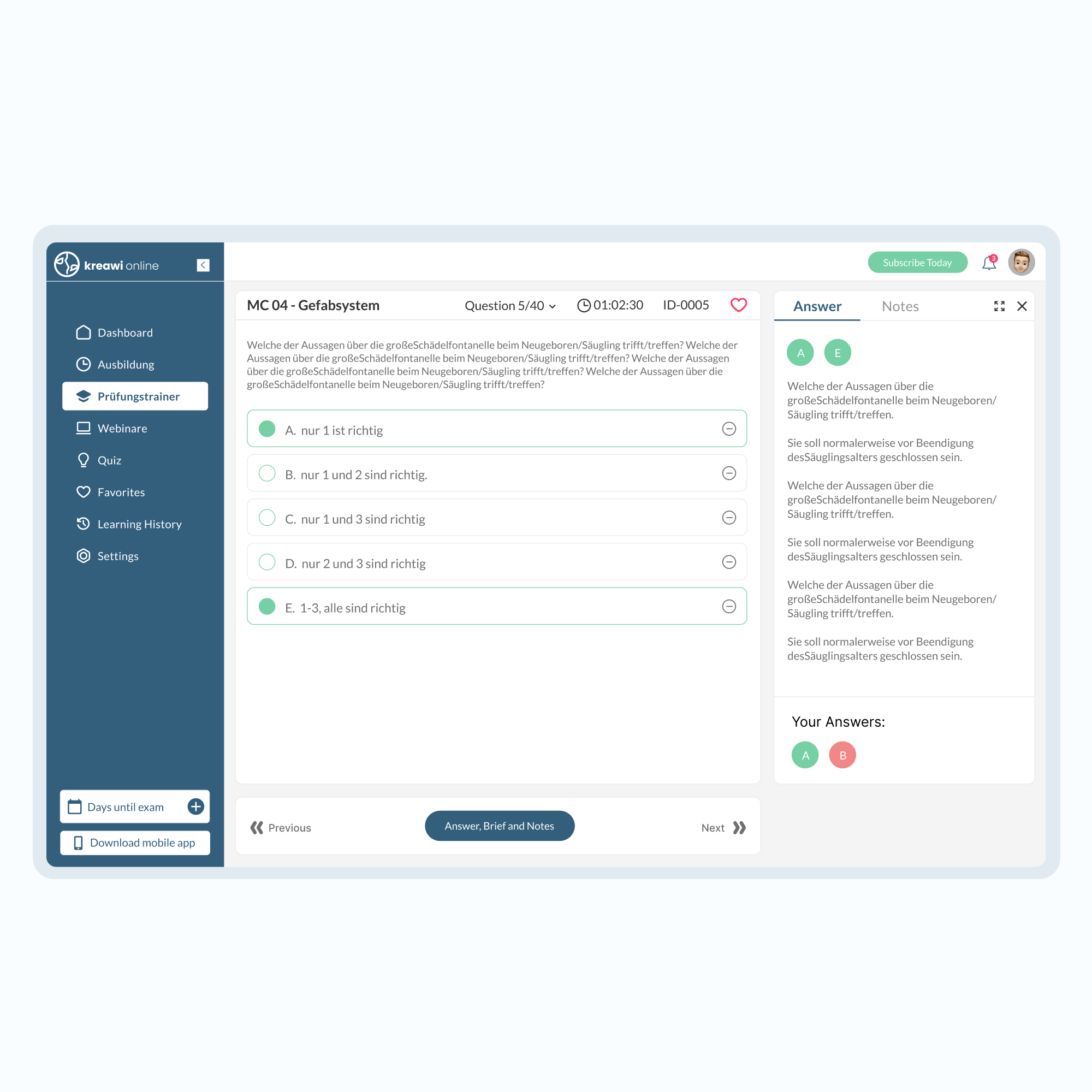
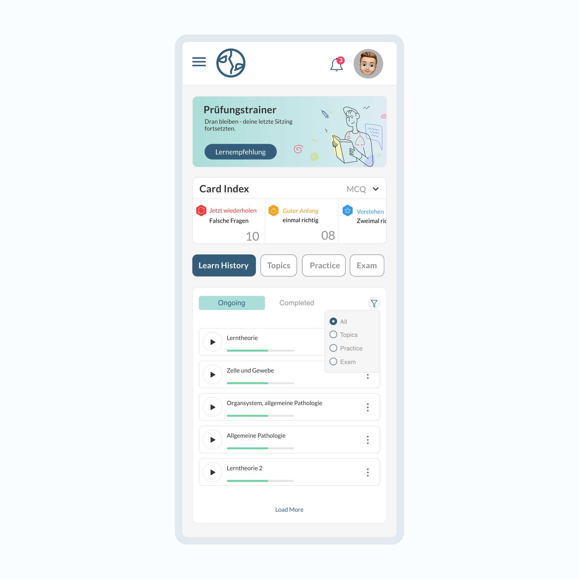
To improve clarity, we restructured the navigation by introducing a simplified top-level menu with tabs beneath it. This new approach eliminated unnecessary layers and provided users with a seamless, intuitive browsing experience.
2
UX Design
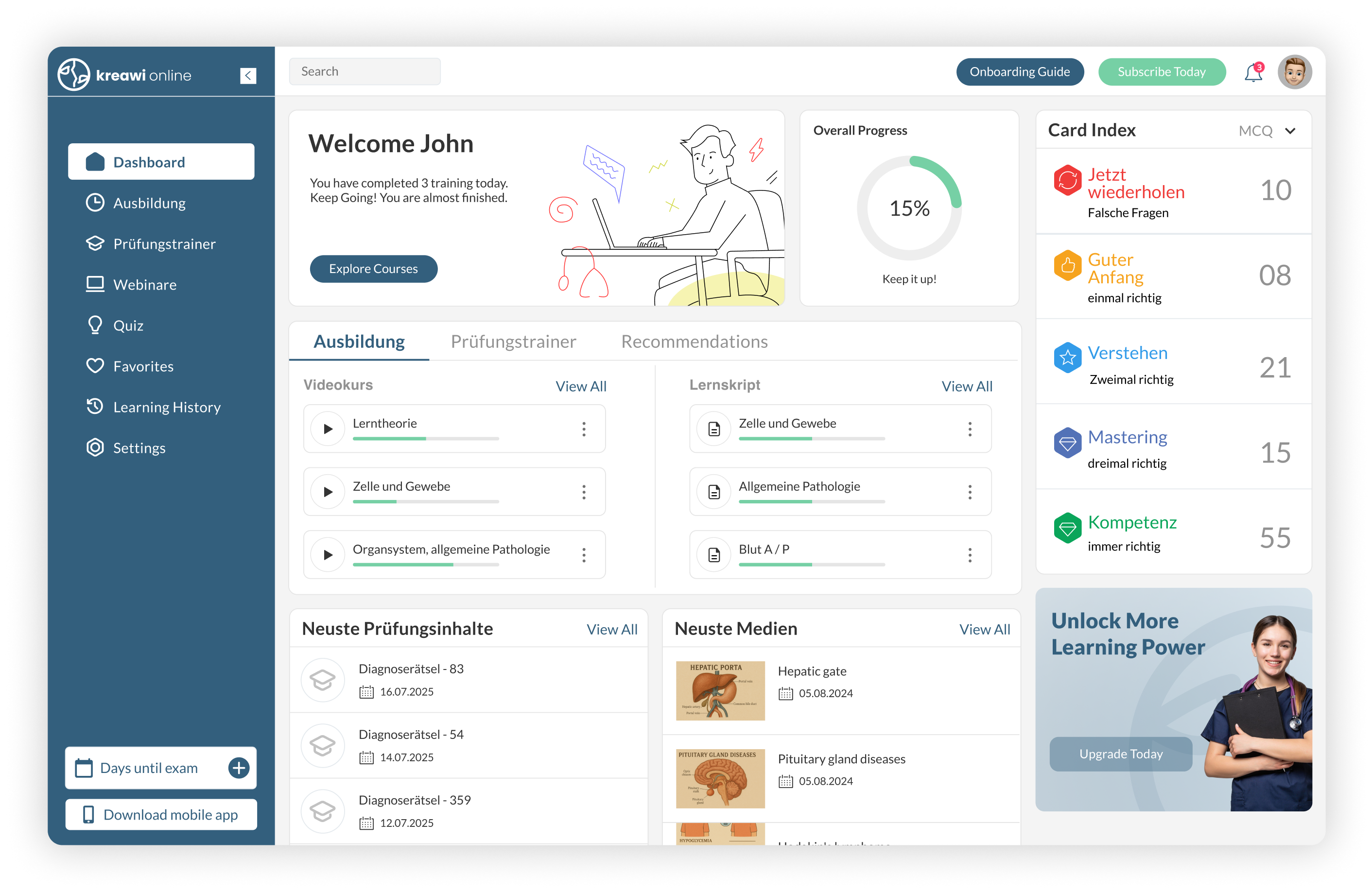
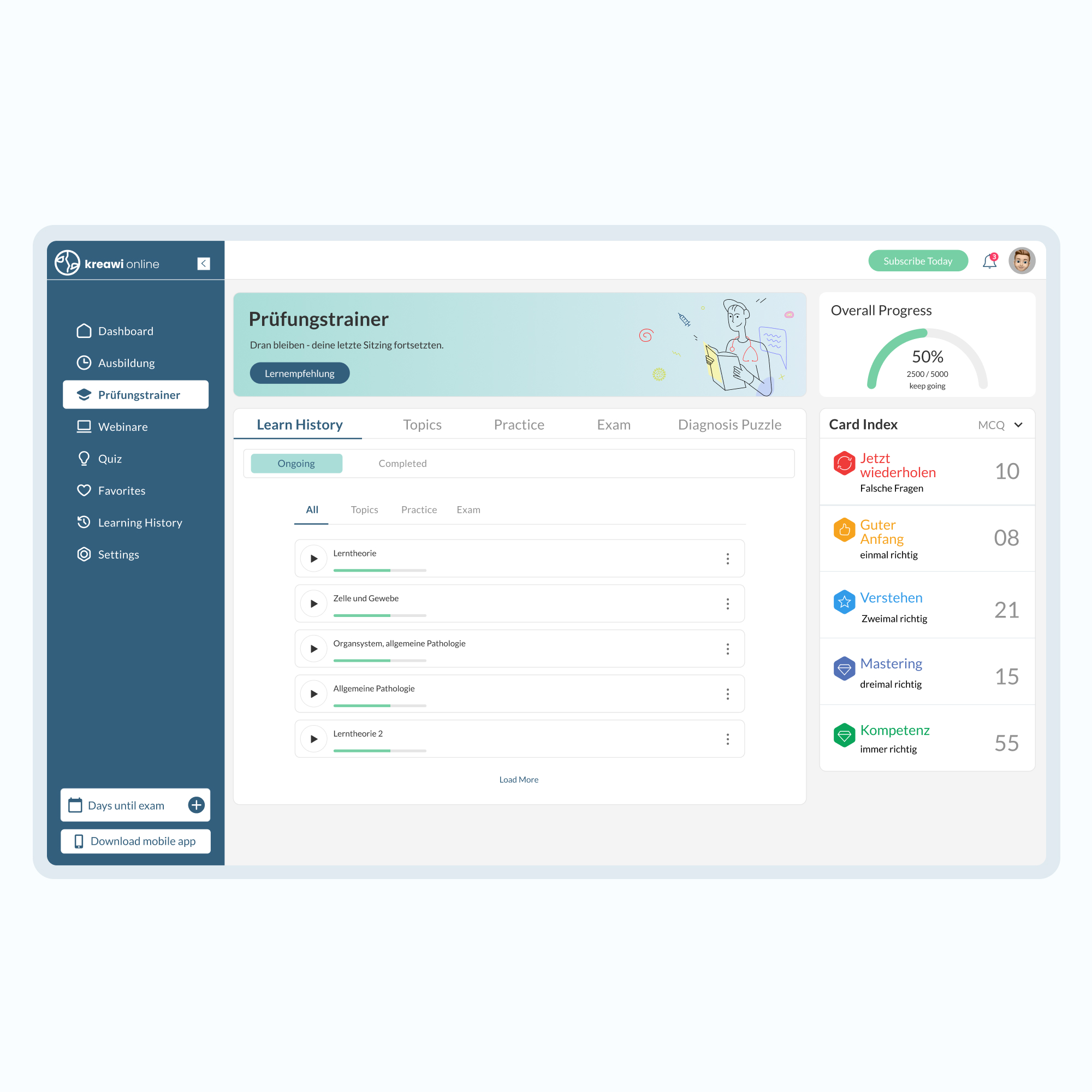
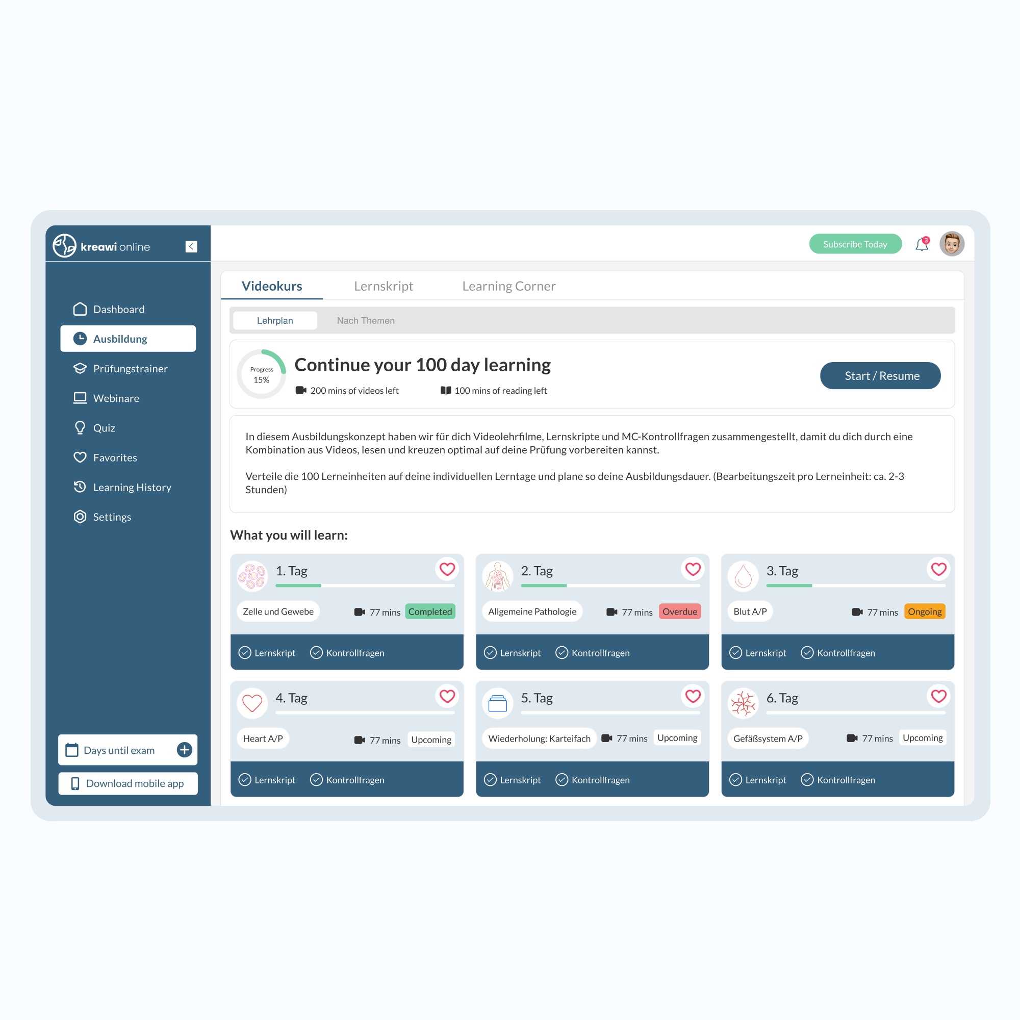
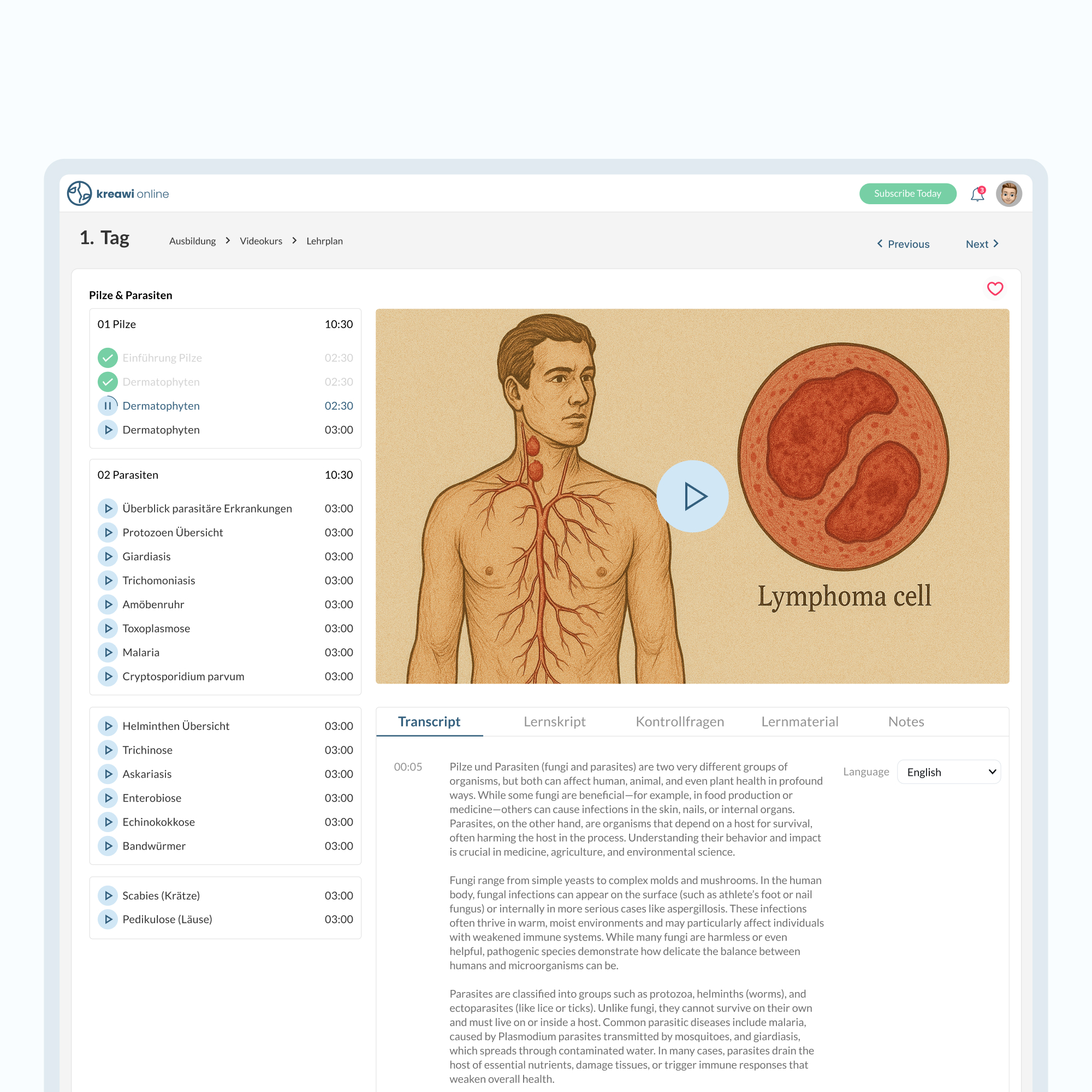
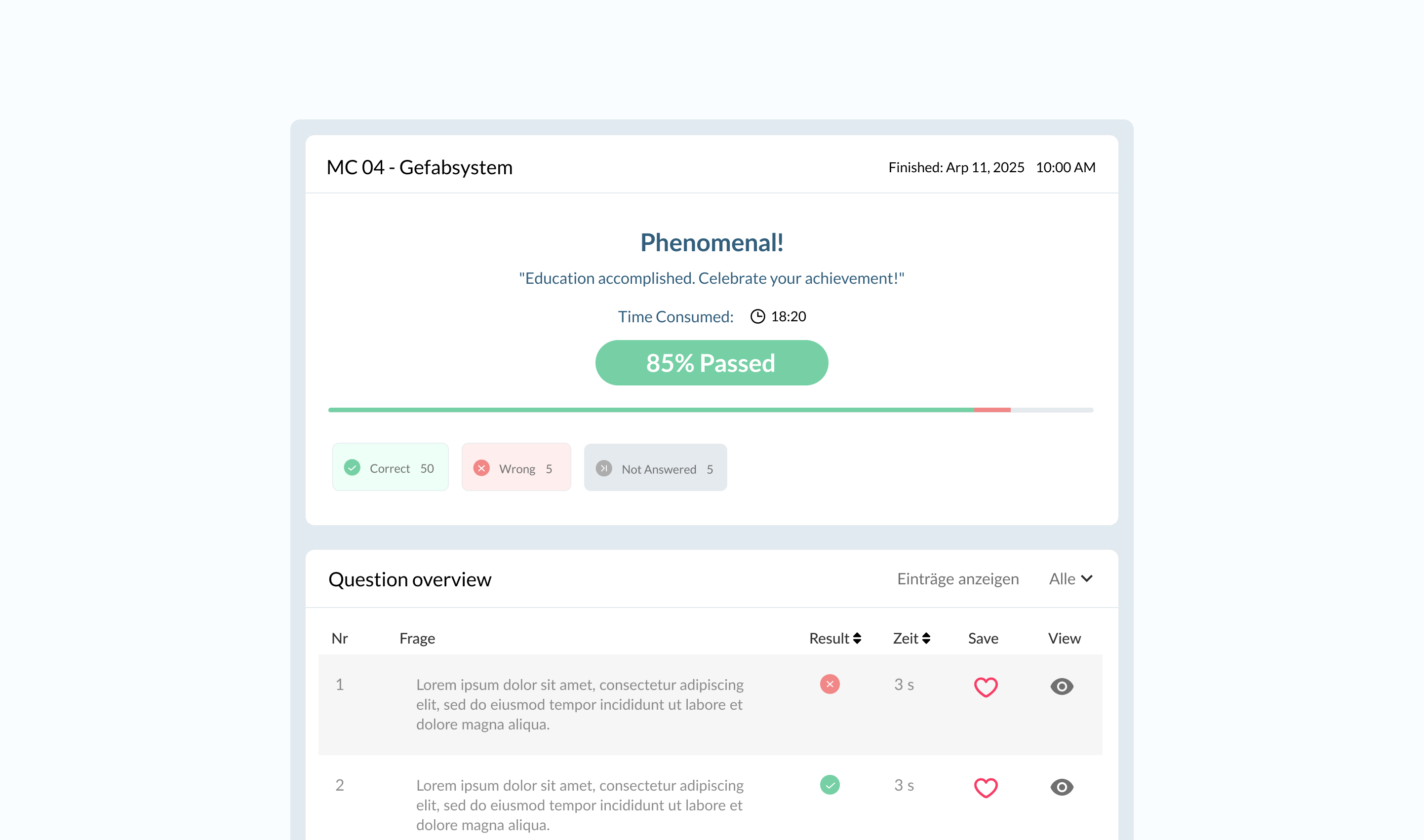
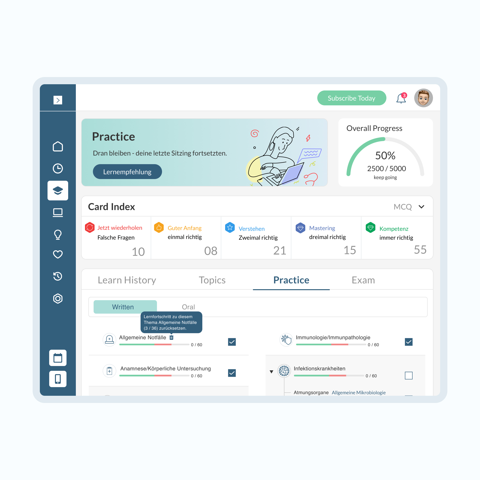
In response to the audit findings, we have enhanced the user experience to be more intuitive and engaging. The onboarding process has been streamlined to facilitate ease of use for new users, minimizing any potential overwhelm. Additionally, we have implemented a cohesive visual style that aligns with the app's branding, resulting in a polished and professional appearance.


let’s get started

home
work
about
contact
dribbble
behance

© 2026, Tarifa Studio. All Rights Reserved.
Kreawi
We led the complete redesign of a learning platform for health practitioners. Starting with a full UX audit of the existing app, we identified key usability issues and opportunities for improvement. Through in-depth UX research, we crafted a user-centered experience supported by a modern UI design. The final solution was designed and prototyped in Figma, delivering a seamless and engaging platform that enhances learning outcomes.
The Challenege
The old platform suffered from poor navigation and a cluttered page structure, making it difficult for health practitioners to find content quickly and complete their learning tasks efficiently. This lack of clarity negatively impacted usability and overall engagement.
Services:UX Audit
UX Research
Iconography
1
Design Audit
We started with a detailed review of the existing platform to evaluate usability, visual consistency, and overall user experience. This helped us identify pain points in navigation, layout, and content hierarchy.
The previous navigation relied on multi-level dropdowns positioned on the left, which created complexity and hindered usability.
To improve clarity, we restructured the navigation by introducing a simplified top-level menu with tabs beneath it. This new approach eliminated unnecessary layers and provided users with a seamless, intuitive browsing experience.
2
UX Design
In response to the audit findings, we have enhanced the user experience to be more intuitive and engaging. The onboarding process has been streamlined to facilitate ease of use for new users, minimizing any potential overwhelm. Additionally, we have implemented a cohesive visual style that aligns with the app's branding, resulting in a polished and professional appearance.

let’s get started


© 2026, Tarifa Studio. All Rights Reserved.
home
work
about
contact
dribbble
behance


Kreawi
We led the complete redesign of a learning platform for health practitioners. Starting with a full UX audit of the existing app, we identified key usability issues and opportunities for improvement. Through in-depth UX research, we crafted a user-centered experience supported by a modern UI design. The final solution was designed and prototyped in Figma, delivering a seamless and engaging platform that enhances learning outcomes.
The Challenege
The old platform suffered from poor navigation and a cluttered page structure, making it difficult for health practitioners to find content quickly and complete their learning tasks efficiently. This lack of clarity negatively impacted usability and overall engagement.
Services:UX Audit
UX Research
Iconography
1
Design Audit
We started with a detailed review of the existing platform to evaluate usability, visual consistency, and overall user experience. This helped us identify pain points in navigation, layout, and content hierarchy.
The previous navigation relied on multi-level dropdowns positioned on the left, which created complexity and hindered usability.
To improve clarity, we restructured the navigation by introducing a simplified top-level menu with tabs beneath it. This new approach eliminated unnecessary layers and provided users with a seamless, intuitive browsing experience.
2
UX Design
From audit to action: we stripped away friction, simplified onboarding, and gave users a smoother start. A consistent design language now powers the app, making it not just easier to use, but sharper, stronger, and unmistakably on-brand.

let’s get started
© 2026, Tarifa Studio. All Rights Reserved.
home
work
about
contact
dribbble
behance